Battle for the Archetypal American Gothic
If there’s one font that has defined the 21st century so far, it’s undoubtedly Gotham. Released in 2000 by (then partners) Hoefler & Frere Jones, Gotham quickly rose to popularity among designers—a phenomenon catalyzed by the design of Obama’s 2008 presidential campaign. Soon, unbridled gothamania swept countless branding projects reaching a level of ubiquity not seen since the emergence of Helvetica in the 1960s.
Strong geometric shapes, tall readable x-height and a clean uniform line quality are what contribute to Gotham’s unapologetic, industrial and unmistakably American presence. Its letters look like steel girders, machine-bent and joined together.
Gotham had successfully revived a style established in the early 20th century, marrying the geometric qualities of Futura (1927) with the self-effacing clarity of Helvetica (1957) to become the archetypal American sans-serif typeface of the 21st century.
But something else was happening. Another revolution in typography started taking root around the time of Obama’s election, a revolution spurred by two technology trends: the rise of high density displays and growing support for custom fonts on the web.
After over 20 years of working with a handful of web-safe fonts that included Arial, Verdana, Tahoma, Georgia and Times New Roman, web designers were champing at the bit to bring new typefaces to the web. Yet, until H&FJ released their Cloud Typography service in mid-2013, the most popular font of our time simply couldn’t be licensed for web use.
And just like that, an unlikely hero emerged.
Proxima Nova, the creation of respected type designer Mark Simonson became the ubiquitous standard of contemporary web typography. Released in 2005, and available via the popular web font hosting service Typekit, Proxima Nova is the American sans-serif typeface that we read daily on BuzzFeed, Spotify, Instagram and nearly every new startup website.
Proxima Nova is a quirkier adaptation of the American Gothic style, less straight-laced than Gotham, with friendlier circular punctuation, tightened kerning and distinctive characters such as the lowercase ‘a’ and ‘f’ that add a welcoming tone to body copy. More on that from Cameron Moll’s excellent oral history of the font.
It can’t be understated that the adoption of Proxima Nova was also facilitated by its exceptional hinting instructions. As the transition to high-resolution screens slowly makes its way to the desktop, particularly via mainstream entrants such as the new Retina iMac, there remains a need for web fonts to also perform well on standard LCD displays across a wide variety of rendering engines (especially Microsoft ClearType). In other words, Proxima Nova can be used at small sizes and looks good on nearly any device.
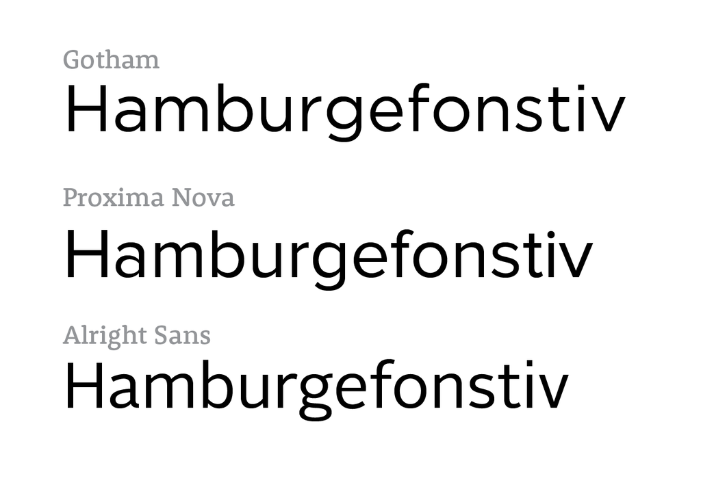
But with all the homage I can pay to Gotham and Proxima Nova, my heart belongs to Alright Sans—Jackson Cavanaugh’s take on the American Gothic. Released in 2009, I’ve designed with Alright Sans almost every day since, using it to build every bit of packaging and UI for Lumi, my personal sites and Edgemade. I can’t get over how beautiful it looks on a retina screen.
For me, Alright Sans is a triumph in the tightrope walk of typography. While Gotham and Proxima Nova rely on their square, perfectly geometric letterforms to impose confidence, they compromise on density and legibility, especially at text sizes and in tabular data. The characters are simply too wide to be functional for many applications, which is why Gotham Narrow is pitched as the text face of choice in the Gotham family. Alright Sans manages the difficult task of retaining strong geometry, while forming tighter, more humanist, more readable paragraphs. It is licensed for web use by Webtype, an underdog compared to Typekit and Hoefler, but full of underrated, beautiful typefaces.
I don’t expect Alright Sans to take on the mantle of America’s next archetypal sans-serif—in fact, I believe Gotham and Proxima Nova will share that honor for the foreseeable future. Alright Sans points to the current renaissance in typography stimulated by advancements in technology, a golden age of typography. If anything ends the battle for the next archetype of American sans-serif, it won’t be a specific font—it will be the proliferation of incredible independent foundries such as Cavanaugh’s Okay Type. Death by a thousand cuts.