↪ Well Made Podcast
If you enjoyed the Edgemade podcast, my new podcast "Well Made" will be right up your alley. It's a continuation of my idea to share practical knowledge about what it takes to get something off the ground – through the lens of good design. I love these conversations and now that it's an official part of what I do at Lumi, I hope to record them much more regularly.
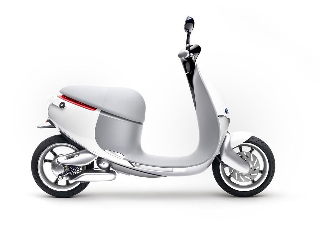
↪ Gogoro: the Tesla of Scooters
It's an inevitable product category. Gogoro seems to be approaching it the right way, with a very design-driven approach. Curious to see if they cross can over from Taiwan to Europe where scooters are also prevalent.
Battle for the Archetypal American Gothic
If there’s one font that has defined the 21st century so far, it’s undoubtedly Gotham. Released in 2000 by (then partners) Hoefler & Frere Jones, Gotham quickly rose to popularity among designers—a phenomenon catalyzed by the design of Obama’s 2008 presidential campaign. Soon, unbridled gothamania swept countless branding projects reaching a level of ubiquity not seen since the emergence of Helvetica in the 1960s.
Strong geometric shapes, tall readable x-height and a clean uniform line quality are what contribute to Gotham’s unapologetic, industrial and unmistakably American presence. Its letters look like steel girders, machine-bent and joined together.
Gotham had successfully revived a style established in the early 20th century, marrying the geometric qualities of Futura (1927) with the self-effacing clarity of Helvetica (1957) to become the archetypal American sans-serif typeface of the 21st century.
But something else was happening. Another revolution in typography started taking root around the time of Obama’s election, a revolution spurred by two technology trends: the rise of high density displays and growing support for custom fonts on the web.
After over 20 years of working with a handful of web-safe fonts that included Arial, Verdana, Tahoma, Georgia and Times New Roman, web designers were champing at the bit to bring new typefaces to the web. Yet, until H&FJ released their Cloud Typography service in mid-2013, the most popular font of our time simply couldn’t be licensed for web use.
And just like that, an unlikely hero emerged.
Proxima Nova, the creation of respected type designer Mark Simonson became the ubiquitous standard of contemporary web typography. Released in 2005, and available via the popular web font hosting service Typekit, Proxima Nova is the American sans-serif typeface that we read daily on BuzzFeed, Spotify, Instagram and nearly every new startup website.
Proxima Nova is a quirkier adaptation of the American Gothic style, less straight-laced than Gotham, with friendlier circular punctuation, tightened kerning and distinctive characters such as the lowercase ‘a’ and ‘f’ that add a welcoming tone to body copy. More on that from Cameron Moll’s excellent oral history of the font.
It can’t be understated that the adoption of Proxima Nova was also facilitated by its exceptional hinting instructions. As the transition to high-resolution screens slowly makes its way to the desktop, particularly via mainstream entrants such as the new Retina iMac, there remains a need for web fonts to also perform well on standard LCD displays across a wide variety of rendering engines (especially Microsoft ClearType). In other words, Proxima Nova can be used at small sizes and looks good on nearly any device.
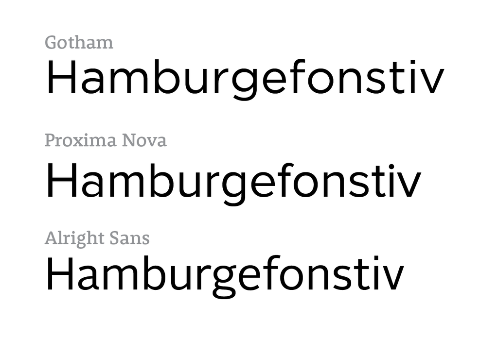
But with all the homage I can pay to Gotham and Proxima Nova, my heart belongs to Alright Sans—Jackson Cavanaugh’s take on the American Gothic. Released in 2009, I’ve designed with Alright Sans almost every day since, using it to build every bit of packaging and UI for Lumi, my personal sites and Edgemade. I can’t get over how beautiful it looks on a retina screen.
For me, Alright Sans is a triumph in the tightrope walk of typography. While Gotham and Proxima Nova rely on their square, perfectly geometric letterforms to impose confidence, they compromise on density and legibility, especially at text sizes and in tabular data. The characters are simply too wide to be functional for many applications, which is why Gotham Narrow is pitched as the text face of choice in the Gotham family. Alright Sans manages the difficult task of retaining strong geometry, while forming tighter, more humanist, more readable paragraphs. It is licensed for web use by Webtype, an underdog compared to Typekit and Hoefler, but full of underrated, beautiful typefaces.
I don’t expect Alright Sans to take on the mantle of America’s next archetypal sans-serif—in fact, I believe Gotham and Proxima Nova will share that honor for the foreseeable future. Alright Sans points to the current renaissance in typography stimulated by advancements in technology, a golden age of typography. If anything ends the battle for the next archetype of American sans-serif, it won’t be a specific font—it will be the proliferation of incredible independent foundries such as Cavanaugh’s Okay Type. Death by a thousand cuts.
Every App is a Superpower
When Google Maps first came out, it blew me away. It still seems like one of the most magical technologies we have today.
I find myself wondering what Magellan would think if you presented him Google Maps running on a phone. The entire world mapped in detail, with photos of every building in every city.
I sat in an airport listening to Tchaikovsky on Spotify, wondering what he’d think if he knew that anyone can listen to high-fidelity recordings of all his compositions. Just a phone and a pair of earbuds—no matter where you are.
What if Gutenberg could hold the world’s knowledge in the palm of his hands, and search Wikipedia for anything he could think of?
Imagine showing Nicéphore Niépce and the Lumière brothers what images they could capture from a camera that fits in your pocket.
And of course, Alexander Graham Bell. Who would have thought that anyone on earth could wirelessly have a face-to-face conversation with nearly anyone else?
Within ten seconds, I can tell you what the weather will be like tomorrow or what the top five restaurants are, for any city in the world. I can have a chauffeur here in 5 minutes, or have my groceries delivered before dinner.
In our pockets is a portal to powers that even kings couldn’t dream of.
Design is Compromise
When did the word “compromise” become vilified?
Compromise is neither good nor bad, it’s just something we do every day. It’s decision making. Prioritizing. Deciding that one thing is more important than another. It’s finding the right balance between two competing desires.
Which compromises you make—now that’s a different question.
Companies (and often politicians) like to tout their decisions as “uncompromising” or having “no compromises”. Plainly, this is impossible. Once you’ve decided on an approach, you’ve inherently decided against a number of other approaches.
A particularly poignant example came from 2011, when Microsoft launched the Surface tablet as a “no compromise” product that allowed users to run both the classic Windows operating system alongside their new touch-based OS. In one of the launch articles, Microsoft’s ex-head of Windows, Steven Sinofsky, repeats
“Our design goal was clear: no compromises. If you want to, you can seamlessly switch between Metro style apps and the improved Windows desktop.”
Obviously, this decision significantly compromised the performance and ease-of-use of the product. Journalists had a field day with Microsoft’s wording.
Recently, my ears tingled when Pebble launched what has now become the most successful crowd-funded product in history: its new smart watch. As the headline states, Pebble Time is an “Awesome Smartwatch, No Compromises”.
I’m not here to throw Pebble under the bus. Quite the opposite. I admire the product they launched. In fact, I admire it for its compromises.
Pebble Time’s biggest compromise is its e-paper display. A decision dear to my heart as I hope to see the technology continue to flourish. Because e-paper requires much less power than LCD or OLED screens, Pebble Time can function, always on, for 7 days on a single battery charge. Contrast that with Apple Watch, which only lasts 18 hours with its OLED screen. What’s more, e-paper performs much better in direct sunlight.
Now of course, Apple wouldn’t be using OLED if e-paper didn’t come with its own compromises. E-paper doesn’t match the “retina” resolution Apple desires, making text noticeably pixelated on the Pebble Time. The color reproduction has a much narrower gamut, making photographs look muted, and the refresh rate of e-paper is also lower, meaning that animations aren’t as smooth.
I find these compromises acceptable, if not better suited to a watch.
The reason companies like to vilify compromise is that being opinionated inherently exposes your approach to a set of weaknesses. The stronger your opinion, the more you compromise something else, the clearer your weaknesses are. Companies don’t like to expose weaknesses, because they worry about scaring away customers.
An 18-hour battery life is absolutely pitiful given that most watches can last years without maintenance or a new battery. But Apple doesn’t try to hide that flaw behind the banner of “no compromise”. In fact, Apple takes pride in its decision-making, as illustrated by their design philosophy: “one thousand no’s for every yes”.
Unlike Microsoft, which took a middle-of-the-road approach, Pebble made a strong decision. Pebble bet on a technology it knew Apple wouldn’t use, and created a distinct, opinionated product. And that’s how Pebble took back its crown as highest grossing Kickstarter campaign. They should take pride in the compromises they chose.
There is more power in what you say ‘no’ to than what you say ‘yes’ to.
Personally, I prefer using the word trade-off than compromise. It better conveys the relationship between strengths and weaknesses. You are trading a weakness for a strength.
Good design is opinionated. Making something great is making the right compromises for the people who will use it.
↪ Spark Electron
Kickstarter campaign for a cellular module that helps create connected hardware. This is an idea we discussed on podcast episode 10 with Tile—I'm incredibly excited to see someone jump on this opportunity. So many devices need occasional polling but can't rely on Wi-Fi. If Spark can effectively manage the relationship with carriers, we're about to see some very exciting new things in IoT hardware. The next step is integrating this puppy with GPS.
A couple weeks ago I had the pleasure of visiting the offices of Automatic where I met co-founder Ljuba Miljkovic. They are the makers of a clever system for monitoring your car using an app and a small device that plugs into the OBD port. We get into its benefits and how they brought it to market.
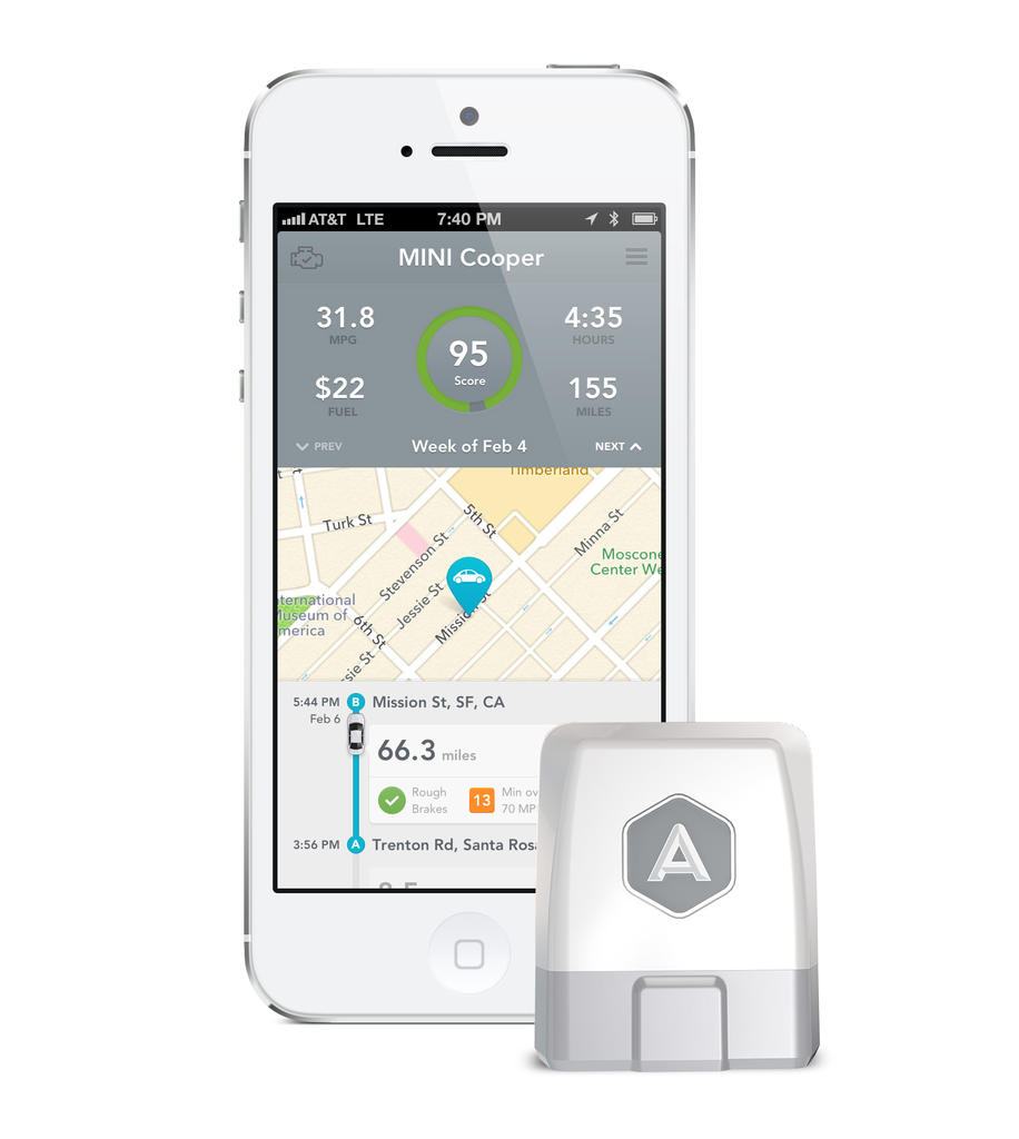
Ljuba and I also dig into the challenges of bringing tech products to retail, especially how to approach designing point-of-purchase displays. Automatic can already be found at Apple Stores and Best Buy, but as software enters every part of our lives we discuss what retailers such as Home Depot are doing to keep up.
Finally, we end with a few ideas around the future of cars. With major companies vying for various parts of the car experience (Apple, Google, Uber, Lyft, etc), and excitement around the self-driving car, we ask ourselves on what time scale these changes will take place. I was reminded of the Max Planck quote: "A scientific truth does not triumph by convincing its opponents and making them see the light, but rather because its opponents eventually die and a new generation grows up that is familiar with it." We can only hope it will be faster than that.
Additional links:
My guest on this episode is Nick Evans, the founder of Tile. Tile is making an elegant Bluetooth-powered tracker that helps you find lost items.
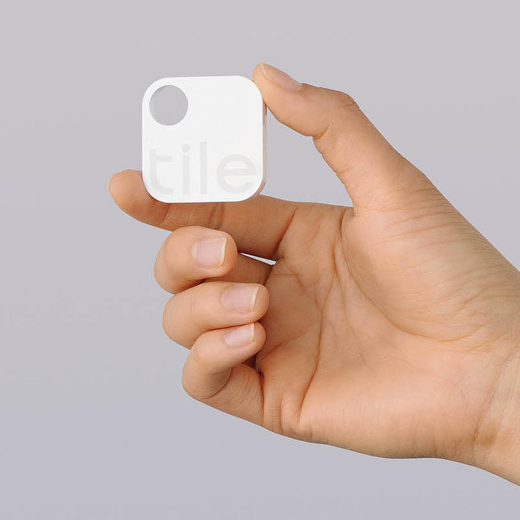
While the idea is simple, executing it with this level of polish and minimalism is always a challenge. On the show we discuss some of the decisions that led to Tile's industrial design, as well as the challenges of crowd-funding the project via a self-hosted campaign. We compare some of the pros and cons of Kickstarter versus options such as Tilt and Selfstarter.
Nick and I also chat about FCC regulations, and what we hope to see from carriers as the internet of things develops. Amazon's Whispernet is an early example of how devices like the e-ink Kindle can benefit from low-bandwidth connections. Opening up such a network to startups would have a profound impact on the types of devices that can be designed.
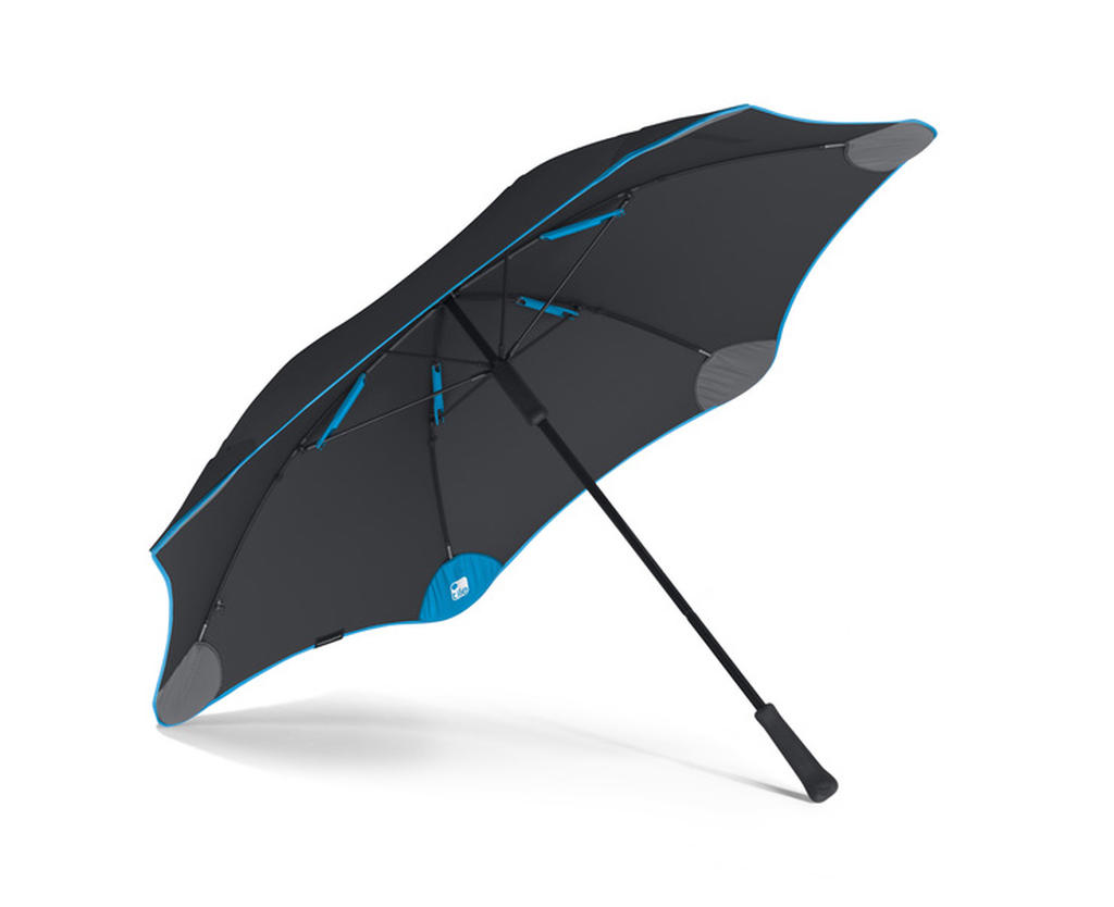
Finally, our conversation was also an opportunity to discuss some of the new collaborations Tile is launching, such as their integration with Blunt Umbrellas.